
Black-and-white real estate photography is the art of presenting property photos in grayscale to emphasize form, light, and texture. It reduces visual noise, highlights architecture, and can make listings feel timeless. For Maple Ridge sellers and agents, Silver Valley Studios Inc. uses monochrome selectively to strengthen a listing’s story while keeping the gallery conversion-focused.
By Silver Valley Studios Inc. — Last updated: June 2, 2026
Above-the-Fold Hook + Table of Contents
Use black-and-white real estate photos to draw attention to shape, light, and materials. Strategic monochrome sets a mood, cleans up color distractions, and complements color galleries. This guide covers when to use it, how to shoot and edit it, gear and software, examples, FAQs, and local tips for Maple Ridge and BC.
Here’s what you’ll learn and how to navigate this complete guide efficiently.
- What black-and-white real estate photography actually is—and isn’t
- Why monochrome images help listings stand out in crowded feeds
- How to shoot, light, and edit for strong contrast and clean tonality
- Approaches: in‑camera monochrome vs. RAW conversions and filters
- Best practices for interiors, exteriors, luxury, and commercial spaces
- Gear and software settings that save time without sacrificing quality
- Maple Ridge–specific considerations for weather, daylight, and staging
- Mini case studies from our Greater Vancouver shoots
- What Is Black-and-White Real Estate Photography?
- Why It Matters for Maple Ridge & BC Listings
- How Black and White Works: Capture to Edit
- Types, Methods, and Approaches
- Best Practices (Interiors, Exteriors, Details)
- Tools, Settings, and Resources
- Case Studies and Real Examples
- Frequently Asked Questions
- Conclusion + Key Takeaways
Quick Summary
Black-and-white real estate photography works best as a supporting style, not a replacement for color. It elevates architectural lines, textures, and lighting, pairs well with HDR and flambient techniques, and performs strongly on social posts highlighting design. Use it sparingly within a color-first gallery to keep buyer expectations clear.
Think of monochrome as a tool in your marketing kit. We use it to remove color distractions, focus attention, and create scroll-stopping hero posts—while still delivering a full color set for MLS and syndication.
What Is Black-and-White Real Estate Photography?
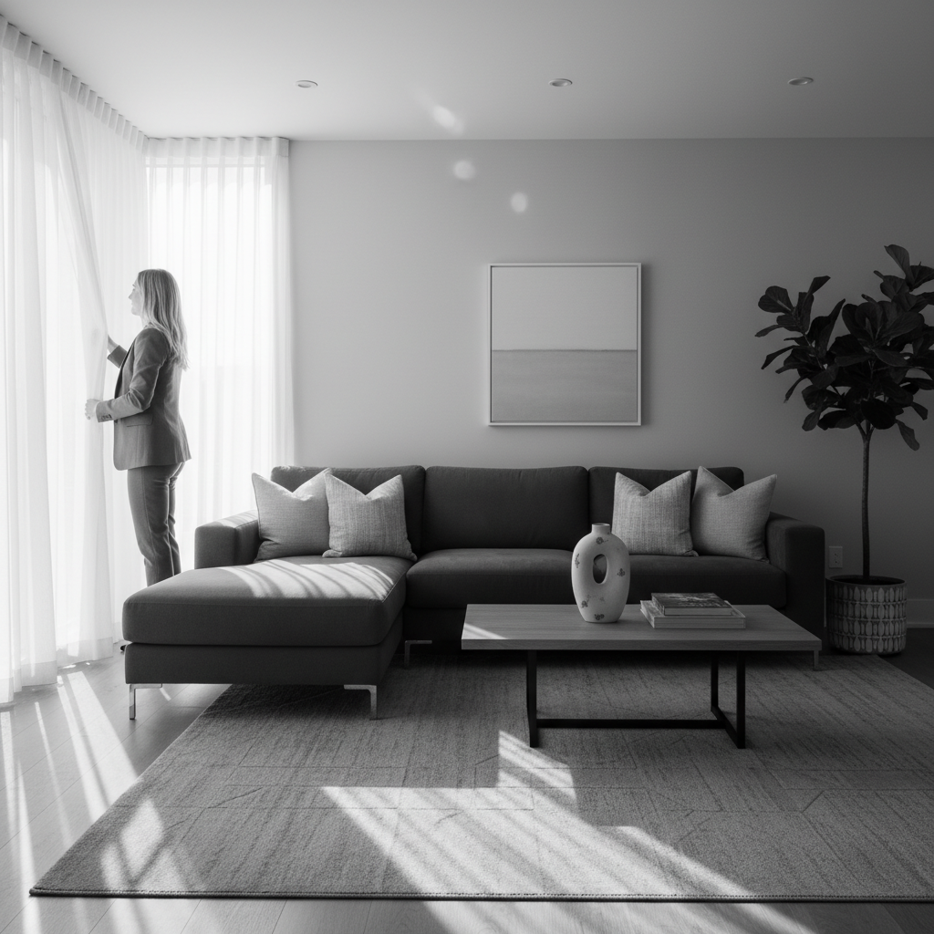
Black-and-white real estate photography presents property images in grayscale to emphasize form, light, and texture. It strips color distractions, clarifies composition, and adds a timeless mood. In practice, it supplements color galleries to guide attention, support brand storytelling, and differentiate listings without confusing buyer expectations.
In our experience across Greater Vancouver, monochrome shines when a space has striking geometry, mixed lighting that would cast competing color temperatures, or materials with texture—stone, wood grain, steel, and glass. It’s a style choice with a strategy behind it.
- Definition in action: We often deliver 25–35 color photos of a home plus 2–5 selective black-and-white images that highlight key design features.
- Primary use cases: Marketing posts, hero website banners, editorial-style property brochures, and dramatic thumbnails for reels or teasers.
- Complement to color: Black-and-white does not replace standard listing imagery; it anchors attention for specific moments in your narrative.
On shoots where the palette is chaotic (bold décor, mixed paint tones), black-and-white removes conflict and helps buyers see the space itself—lines, light, and layout—first.
Why It Matters for Maple Ridge & BC Listings
In Maple Ridge and across BC, moody skies, evergreen tones, and varied interiors can distract the eye. Black-and-white simplifies scenes, pushing buyers to notice structure and light. Used thoughtfully, it can increase thumb-stopping on social, strengthen brand identity, and elevate luxury or architectural features.
Here’s why this approach earns its keep in our region.
- Weather advantage: Overcast days are common. Soft daylight produces gentle gradients that convert beautifully to monochrome, revealing detail in siding, stone, and trim.
- Design-forward buyers: Many Greater Vancouver buyers browse on mobile first. High-contrast frames often outperform color thumbnails when the palette is busy.
- Brand consistency: Developers and teams can create a recognizable look—alternating color carousels with 1–2 black-and-white frames to cue sophistication.
We’ve found that posts pairing a dramatic monochrome hero with a color carousel behind it improve saves and shares on design-forward listings. For teams building brand equity, this consistency matters.
Local considerations for Maple Ridge
- Leverage overcast mornings for exterior textures; Maple Ridge’s soft cloud cover gives even light that converts to smooth tonal ranges.
- Schedule interiors after noon in winter to maximize window luminance; maintain 1/60–1/125 shutter with ISO 100–400 for crisp detail.
- Keep staging neutral; monochrome accentuates wrinkles and clutter. Minimal props, clean lines, and pressed textiles read best.
How Black and White Works: Capture to Edit
Start with RAW files, expose for highlights, and compose for geometry. In post, convert using channel mix or HSL tools, set a clean white/black point, and balance midtones. Blend HDR or flambient when needed. The goal is rich texture, controlled contrast, and natural tonality without crushed shadows or blown windows.
Below is a simple, reliable workflow we use at Silver Valley Studios Inc. for residential and commercial shoots.
Capture checklist (on-site)
- File format: Shoot RAW for maximum latitude; 14-bit if available.
- Exposure: Protect highlights (windows, fixtures). Aim histogram slightly right without clipping. Typical settings: ISO 100–200, f/7.1–f/9, 1/60–1/125 sec.
- Lenses: 16–35mm for interiors (18–22mm sweet spot to avoid distortion), 24–70mm for details, 70–200mm for exteriors or compressing lines.
- Stability: Tripod for consistency; keep horizon within ±0.5° for clean verticals.
- Lighting: Use natural light when possible. Add a bounced flash pop only if you need to lift shadows 0.5–1 stop.
Editing checklist (studio)
- Base conversion: In Lightroom or Capture One, convert to B&W and adjust color channels (e.g., lower blue to deepen skies, raise yellow for brighter wood).
- Contrast curve: Add a gentle S-curve, then set white/black points so highlights peak around 95–98% and shadows don’t crush below ~5%.
- Local dodging/burning: 0.2–0.4 stops to guide the eye along leading lines and pull attention to texture.
- Sharpening: Radius 0.8–1.2; Masking 40–60 to preserve edges without amplifying noise.
- Noise: Keep ISO low; if needed, reduce luminance noise 10–20 while preserving detail.
HDR and flambient for monochrome
- HDR bracketing: Merge 3–5 frames spaced 1–2 EV for balanced windows and interiors; then convert to monochrome to control tonal mapping.
- Flambient adaptation: Blend a natural ambient frame with a flash-lit frame (flash bounced). Convert after blending to keep skin tones irrelevant and textures crisp.
- Window control: Aim to keep exterior view visible at −1 to −2 EV relative to interior mids for realistic depth.
Consistency beats intensity. A tasteful monochrome with strong midtone separation reads better than a harsh, contrast-heavy frame that hides detail.
Types, Methods, and Approaches
There are three reliable approaches: shoot in RAW and convert in post, shoot JPEG using an in‑camera monochrome profile for previews, or use selective monochrome within a color-first gallery. For control and consistency, RAW-to-monochrome conversion delivers the best result for real estate marketing.
Monochrome approaches compared
| Approach | When to Use | Pros | Watch-outs |
|---|---|---|---|
| RAW capture + post conversion | Most listings; interiors with mixed light | Maximum control; reversible; best tonality | Requires editing discipline; more steps |
| In‑camera monochrome (JPEG) | Fast social teasers; scouting | Immediate look; simple workflow | Limited latitude; baked-in contrast |
| Selective monochrome in gallery | Brand/editorial frames | Differentiates; anchors attention | Overuse can confuse buyer expectations |
Filters and channel control
- Digital color filters: Simulate red/orange/yellow/green filters in software to alter tonal response (e.g., darken sky, brighten foliage).
- Channel mix: Push/pull blue for sky/water, yellow for wood/cabinets, red for brick. Subtle shifts (±10–20) go a long way.
- Plugin workflows: Tools like Silver Efex deliver precise grain/toning; keep grain minimal for MLS clarity.
Where black-and-white excels
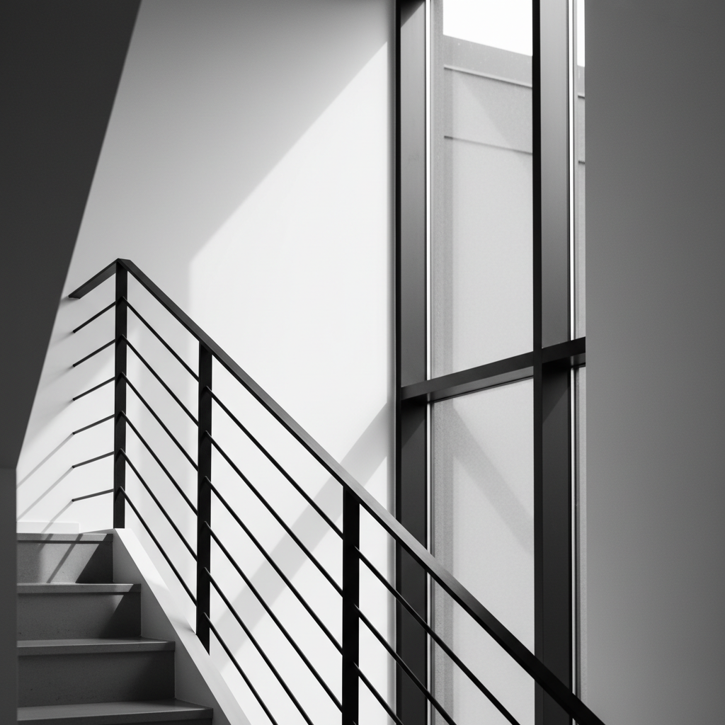
- Architectural exteriors: Angular rooflines and siding textures benefit from directional light and moderate contrast.
- Detail storytelling: Railings, tile patterns, and hardware read crisply without color conflicts.
- Commercial mood: Editorial frames for lobby features or restaurant ambiance can look intentional and premium.
A practical rule: if color adds meaning (views, landscaping, materials), keep color. If color distracts from structure or light, test a monochrome variant.
Best Practices (Interiors, Exteriors, Details)
Plan for geometry, control contrast, and stage minimally. Keep verticals straight, protect highlights, and build midtone separation. Use 18–22mm for interiors, a tripod for consistency, and a gentle S-curve in post. Deliver B&W sparingly—2–5 frames per listing—to elevate the story without replacing color.
Interiors
- Composition: Align verticals; use leading lines from floors, counters, or stair rails.
- Light: Window light from the side creates depth; avoid mixed color sources that complicate tonality.
- Settings: ISO 100–200, f/8, 1/60–1/100 sec, tripod; bracket 3 frames if windows risk clipping.
- Staging: Neutral textiles; remove colorful items that would convert to dull grays.
Exteriors
- Timing: Overcast or late golden hour yields soft highlights; deep shadows can hide siding detail.
- Angles: Use a 2-point perspective to keep lines honest; avoid extreme keystoning.
- Details: Emphasize materials—stone, wood grain, metal; add a detail shot at 70–100mm for compression.
Details and lifestyle
- Story beats: Faucet close-up, banister curve, tile pattern, or a sunlit plant—one or two per set.
- Depth of field: f/2.8–f/4 for isolation; keep key edges sharp.
- Processing: Local dodge/burn 0.2–0.4 stops to shape micro-contrast.
For social posts, pair a single monochrome hero with a color carousel to maintain MLS clarity while earning more saves and shares.
Tools, Settings, and Resources
Use a full-frame body with a stabilized 16–35mm, a sturdy tripod, and RAW capture. Edit in Lightroom, Capture One, or Photoshop with calibrated displays. Save time with presets that set black/white points, a gentle S-curve, and channel defaults per room type.
Recommended kit and workflow guidelines we rely on for consistent delivery.
- Cameras: Full-frame or APS-C with good dynamic range (≥ 13 stops recommended for window retention).
- Lenses: 16–35mm f/4, 24–70mm f/2.8, 70–200mm f/4; bring a tilt-shift if you need perfect vertical control.
- Support: Carbon-fiber tripod, 3-axis head, bubble level; remote trigger for vibration control.
- Lighting: Speedlight for subtle lifts; shoot at −1.0 flash compensation to keep ambient feel.
- Software: Lightroom Classic or Capture One for global tone control; Photoshop for flambient blends.
- Presets: Create room-type presets (kitchen, bath, living); set white/black points and channel offsets you trust.
Looking for cohesive media beyond photos? See how we pair video, floorplans, and drone in our full services overview and videography services to increase engagement and inquiries.
Case Studies and Real Examples
Selective black-and-white frames helped multiple Greater Vancouver projects earn more saves and shares without confusing MLS buyers. We used monochrome to spotlight architecture, control mixed lighting, and create editorial assets for social, while delivering full color sets for listings.
Maple Ridge single-family showcase
- Challenge: Overcast day with competing exterior colors.
- Approach: Exterior hero in black-and-white to emphasize rooflines and textures; 28 color images for MLS.
- Outcome: Social post saved and shared widely; the monochrome hero earned the highest engagement of the carousel.
Surrey contemporary condo
- Challenge: Warm LED strips clashing with cool window light.
- Approach: Flambient interior blend, then monochrome conversion for the feature wall detail; color gallery for rooms.
- Outcome: Cleaner perception of finishes; detail shot used as banner art on marketing brochure.
Commercial office lobby (Greater Vancouver)
- Challenge: Mixed décor palette and reflective surfaces.
- Approach: Editorial black-and-white lobby feature plus color coverage for wayfinding and tenant information.
- Outcome: Editorial image adopted as a long-term brand asset across web and signage.
Browse our portfolio for recent projects and our commercial office shoot or restaurant project for examples of story-first visuals beyond listing photos.
When to Use Color vs. Black-and-White
Use color for accuracy (finishes, landscaping, views) and black-and-white for design emphasis (lines, texture, light). A practical split is 90–95% color with 5–10% monochrome editorial frames. This preserves buyer clarity while delivering eye-catching assets for social and brand storytelling.
| Scenario | Choose Color When… | Choose B&W When… |
|---|---|---|
| Kitchen with premium finishes | Material color matters (stone, cabinetry, fixtures) | Bold palette distracts from lines or light |
| Exterior with lush landscaping | Greens/flowers sell the lifestyle | Moody sky and strong siding texture |
| Architectural staircase | You need material color accuracy | Geometry is the hero; shadows define form |
| Commercial lobby | Wayfinding and brand colors are critical | You want editorial mood for a hero banner |
Integrating with Video, Floorplans, and Drone
Keep photos and video color-consistent for MLS, then weave selective monochrome clips or frames into reels and teasers. Pair hero B&W stills with color walkthroughs, 2D floorplans, and aerials to cover accuracy and mood. The mix builds trust while boosting social engagement.
Our end-to-end coverage helps teams coordinate across formats.
- Video: Use color as the base. Add a 1–2 second B&W beat on an architectural reveal to punctuate rhythm. Explore our videography services for examples.
- Floorplans: 2D plans answer sizing questions the photos can’t; together they reduce uncertainty for buyers.
- Drone: Aerial color shots establish location and context; consider one monochrome aerial for textures (roofing, hardscape) as an editorial asset.
- Commercial & restaurants: See our restaurant project to understand how mood and clarity can coexist.
For a tailored plan, start with our services overview or contact us to discuss your next listing or brand shoot.
Brand and Marketing Tips for Realtors
Use black-and-white frames as brand anchors: one hero per carousel, a banner on your services page, or a reel opener. Maintain consistent crop ratios and contrast so your feed feels cohesive. Alternate color and monochrome posts to create a signature rhythm buyers recognize.
- Carousels: Lead with a strong B&W hero; follow with 6–9 color frames that cover the full home story.
- Reels/shorts: Open with a monochrome reveal cut to a beat, then switch to color for a 3–5 second walk-in shot.
- Brand kit: Decide on a contrast range and grain policy (usually “no grain” for listing clarity) and stick with it.
- Signage and collateral: Industry guides like this sign size explainer show why visual hierarchy matters. Apply the same thinking to your image sequencing and type contrast.
For portfolio inspiration and recent commercial visuals, browse our portfolio.
Get a Cohesive, Scroll-Stopping Media Package
Pair color-first listing coverage with selective black-and-white editorial frames, cinematic video, drone, and 2D floorplans. A cohesive set builds trust, highlights design, and performs on social. We’ll scope your next Maple Ridge or Greater Vancouver project to your brand and audience.
We cover everything under one roof—HDR photos, cinematic 4K and vertical video, drone, floorplans, and brand content. See our services or contact us to plan your next shoot.
Frequently Asked Questions
Black-and-white real estate photos work best as editorial accents. Keep most of your gallery in color for accuracy, then add 2–5 monochrome frames to highlight architecture and mood. Below are concise answers to common questions from agents and developers.
When should I choose black-and-white over color?
Use black-and-white when color distracts from design—strong lines, textures, or mixed lighting. Keep color for finishes, views, and landscaping where accuracy sells the lifestyle. A practical split is 90–95% color with 5–10% monochrome editorial frames.
Will monochrome hurt my MLS performance?
No—when used sparingly and paired with a complete color set. Black-and-white shots should support your story, not replace accurate representations. We deliver color-first galleries for MLS and use monochrome for editorial and social assets.
How many black-and-white images should a listing include?
Typically 2–5 per listing. Enough to anchor attention and highlight design elements without confusing buyer expectations. The exact number depends on architecture, lighting, and how you plan to use the images across web and social.
Can I request both B&W and color versions of the same shot?
Yes. We capture RAW files and can export both versions when it supports the story. We’ll recommend where monochrome strengthens attention and where color clarity is essential for materials and views.
Conclusion: Use Monochrome as a Strategic Accent
Treat black-and-white as a precision tool: use it to spotlight lines, light, and texture while keeping a color-first gallery for accuracy. This balance earns attention on social, reinforces brand identity, and preserves buyer trust throughout the listing journey.
Key takeaways
- Black-and-white highlights geometry and texture—use it to guide the eye.
- Keep 90–95% of your gallery in color; add 2–5 monochrome frames.
- Shoot RAW, protect highlights, and convert with gentle contrast.
- Pair with video, 2D floorplans, and drone for a complete story.
- Be consistent: set a brand look for contrast and cropping.
Next steps
- Review our services and videography to plan mixed media.
- Explore recent work in the portfolio and commercial office case.
- Ready to collaborate in Maple Ridge or Greater Vancouver? Contact our team.
For additional context on visual hierarchy and listing presentation, see general industry guides like this listings guide and a market presentation overview, plus signage best practices in this branding primer.