


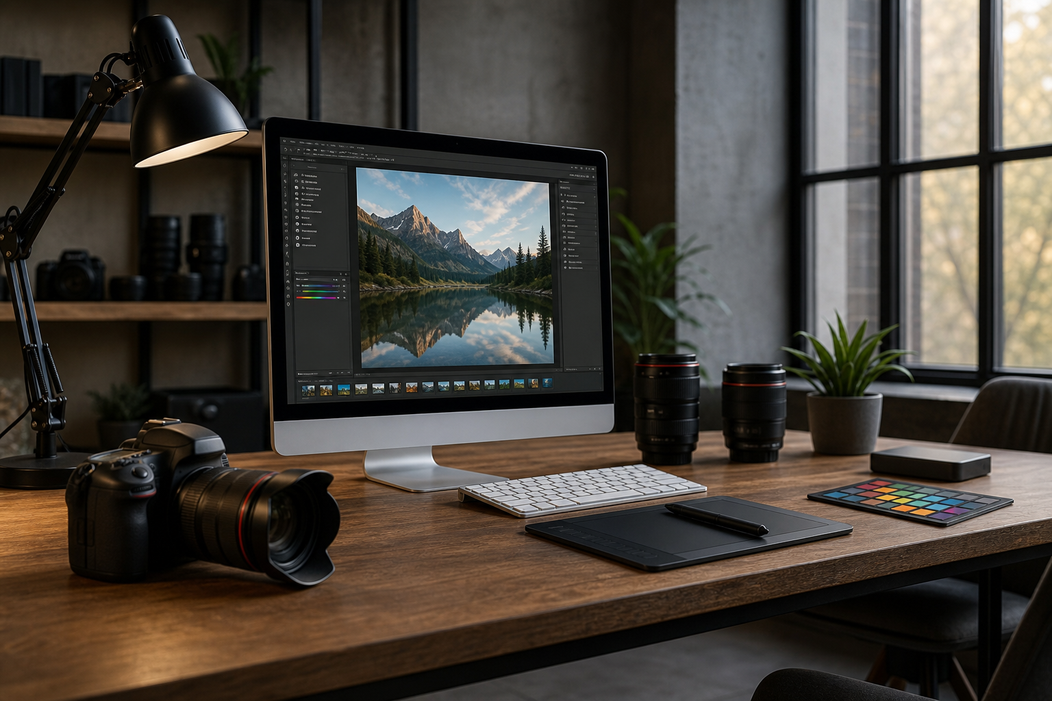
Whether you’re refreshing your website, polishing LinkedIn profiles, or building an image library for ongoing campaigns, strong team and workspace photography does more than document a place—it communicates how you work, what you value, and why people should trust you. Use this guide to plan, light, compose, and direct an efficient shoot that yields natural, on‑brand images you can repurpose across platforms.
Key Takeaways
- Effective team and workspace photography enhances brand perception and builds trust.
- Planning a shoot like a creative brief ensures that the right images are captured for various platforms.
- Lighting and composition are critical in creating visually appealing and authentic images.
- Natural poses and styling can significantly improve the quality of your photography.
- Consistency across channels is key to maintaining brand identity in visual content.
Plan your shoot like a creative brief
Great results begin before the camera comes out. Treat your session like a mini brand project.
- Define outcomes: list where images will live (website hero, about page, careers, newsletters, social carousels, slide decks, press kits) and the required orientations (horizontal, vertical, square).
- Create a visual North Star: assemble 6–10 reference images that feel authentic to your culture. Note lighting style (bright and airy vs. moody), color temperature (cool vs. warm), and posing vibe (candid vs. semi‑posed).
- Draft a shot list: include headshots, leadership group, small team breakouts, collaboration scenes, individual focus work, workspace wide shots, details (tools, signage, textures), reception, and exterior context.
- Schedule around operations: select windows of low foot traffic; alert teams about timing, wardrobe, and tidy‑up expectations.
- Assign roles: a floor manager to wrangle people, a styling lead to check tidiness and brand items, and a runner for quick adjustments.
Shape and balance the light
Light communicates mood and the quality of your environment. Use it to flatter people and clarify space.
- Start with what’s free: place subjects near large windows, facing the light. Turn off mixed‑temperature ceiling strips that cause color casts when possible.
- Match color temperatures: if practical lights must stay on, set white balance to a middle ground and keep consistent across scenes.
- Soften, don’t blast: use diffusion (sheer curtains, translucent panels, or softboxes) to tame harsh sun. Bounced light off a white wall or foam board creates clean fill.
- Lift the shadows: a simple reflector opposite the key light restores dimension without making faces shiny.
- Shape with flags: a black card or flag on the shadow side adds subtle contrast that sculpts jawlines and prevents a flat look.
- Keep it believable: aim for lighting that feels like your workspace, just tidier and more intentional.
Compose for people and place
Your composition should serve the story: teamwork, focus, craft, service, or innovation. Use framing that leaves room for copy and cropping later.
- Plan negative space: for hero images, compose with breathing room on one side for headlines or UI overlays.
- Mind the background: simplify by removing clutter and aligning horizontals. Look for clean lines, brand colors, and depth.
- Use layers: foreground objects (plants, glass walls, equipment) add context and dimension when kept subtle and unfocused.
- Vary perspectives: mix eye‑level for authenticity, slightly elevated for teams around tables, and low angles to add presence in wide office scenes.
- Anchor with triangles: when posing groups, arrange heights and angles to create stable visual triangles that feel balanced.
Guide real people into natural poses
Most teams aren’t models. Direction should be light, encouraging, and specific.
- Give an action: “Walk toward me while chatting,” “Point at the sketch and react,” or “Type, then glance to your teammate.” Actions produce genuine expressions.
- Hands matter: suggest anchors like notebook edges, coffee mugs, or laptop lids to avoid awkward floating hands.
- Micro‑adjust posture: “Shift weight to back foot,” “Drop shoulders,” or “Angle nose to the window” quickly improves lines.
- Find everyone’s best side: a slight turn (10–20 degrees) and a chin forward/down usually flatters most face shapes.
- Keep energy high: rotate people often, show quick previews to build confidence, and celebrate wins as you go.
Style the workspace with purpose
Styling is not about staging a fiction. It’s about presenting your real environment at its best.
- Declutter first: clear cables, excess stationery, random boxes, and outdated signage. Keep a small caddy for quick sweeps.
- Prioritize brand artifacts: badges, notebooks, packaging, product prototypes, awards, or wall graphics subtly reinforce identity.
- Balance color: unify desk items by hue (neutrals work well). Avoid large distracting color blocks unless they match your palette.
- Greenery as texture: plants add life and break up straight lines; place them to frame, not block, faces.
- Wardrobe cohesion: share a simple palette guide ahead of time; avoid loud patterns and overly reflective fabrics.
Keep it moving: workflow and shot list
A smooth cadence keeps teams engaged and minimizes operational disruption.
- Walkthrough: 10–15 minutes to scout light, finalize angles, and mark two backup locations per scene.
- Scene blocking: place chairs, clear backgrounds, and set reflectors before you call the first subject.
- People rotation: photograph 2–4 people per micro‑scene; swap quickly to capture variety while energy stays fresh.
- Coverage per scene: a wide establishing frame, a medium interaction shot, and two details (hands, tools, textures) builds a storytelling set.
- Checkpoints: every 30–40 minutes, review 6–8 frames for focus, expression, and brand alignment; adjust for the next block.
Capture brand consistency across channels
Consistency builds recognition and trust. Align your capture to the way images will actually be used.
- Aspect ratios: for sites and decks, shoot horizontals; for profiles and social, gather verticals and squares of key moments.
- Background language: repeat a few recognizable textures (woodgrain table, painted feature wall, frosted glass) across sets for cohesion.
- Expression bank: collect a range—confident, welcoming, focused, celebratory—so creative teams can match tone to message.
- Iconic angles: identify 2–3 brand‑signature angles (e.g., collaboration table corner, entry corridor perspective) and revisit them over time.
Post‑production that respects reality
Editing should polish, not transform. Aim for believable color, clean skin tones, and readable spaces.
- Color first: set a consistent white balance across the set; correct mixed lighting rather than leaning into strong tints.
- Contrast with care: preserve highlight detail in windows and soft roll‑off on skin; avoid crunchy textures on faces.
- Perspective fixes: straighten verticals on architecture and furniture to avoid leaning walls.
- Retouch lightly: remove temporary blemishes and lint; keep natural skin texture.
- Output variants: export web‑ready sizes for different platforms to ensure optimal display.
Sources & References
For further reading and authoritative data on photography best practices, consider the following resources:
- Digital Photography School - A comprehensive resource for photography tips and techniques.
- Photography Talk - Insights and discussions on photography trends and practices.
- The Balance SMB - Articles on branding and visual marketing strategies.
A practical next step
To discuss the options that apply to your situation, contact Silver Valley Studios Inc. and request the relevant details before moving forward.